
Marriott Bonvoy
Conversion Funnel Analysis & Redesign
Tools used
Sketch, Invision, Figma
Marriott Bonvoy’s Homes and Villas vacation rental site was underperforming, and they were not hitting their conversion targets. Looking under the hood for a conversion analysis, we found that the site was reaching its goals for homepage visits and search page visits, and then was experiencing a 40% drop in users between the search results page and the product pages. I redesigned the search results to eliminate customer pain points and increased conversion. I also worked with my product manager to create an iterative improvement schedule based on user testing.

Mobile Improvements
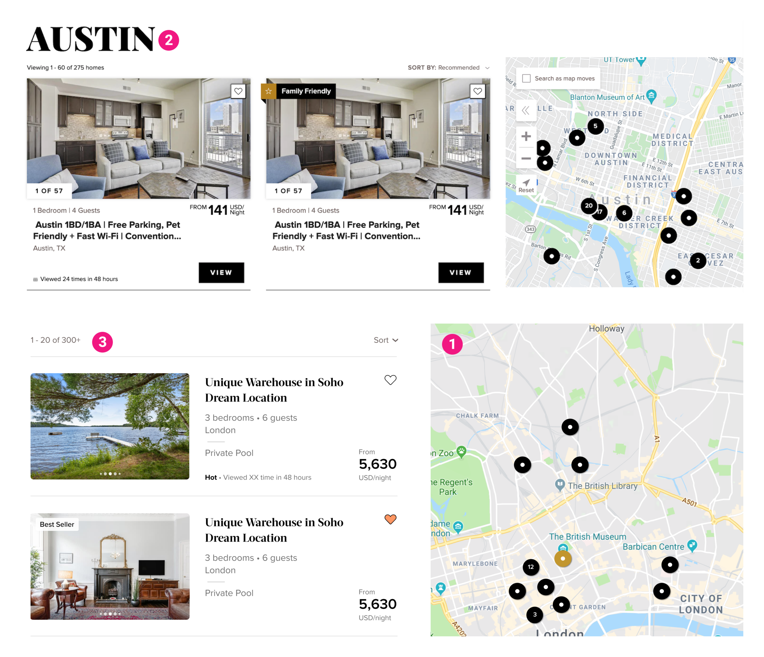
1. Changed the indicator that the images were scrollable to pagination dots, and made the pagination buttons visible upon hover to showcase more of the product photo. User studies from AirBnb show that quality photos are the most important factor in conversion.
2. Removed low value clutter to focus the attention on the product photos.
3. Reduced the visual impact of the save button to focus the attention of the product photos.
4. Streamlined the flag feature to only include best seller to limit customer confusion.
5. Removed the CTA and made the entire search result an actionable area.
6. Brought in branding by including the serifed font.
7. Rearranged the information hierarchy to make the type more legible and to bring valuable information to the front.
8. Clearly showcased the price to make the search results quickly scannable.

Tablet Improvements
1. Introduces a two column layout to increase the legibility and scanability of the results.
2. With the increased space I called out key home features and added a scarcity prompt, to add differentiation to the results.
3. Brought in branding by adding the brand color to the save button.
Desktop Improvements
1. Expanded the size of the map to make it easier to read and interact with.
2. Removed the location title to because it provided very little value to the user. This brought the search results higher on the page.
3. Increased the white space around the number of results and sort button to make them more actionable.


